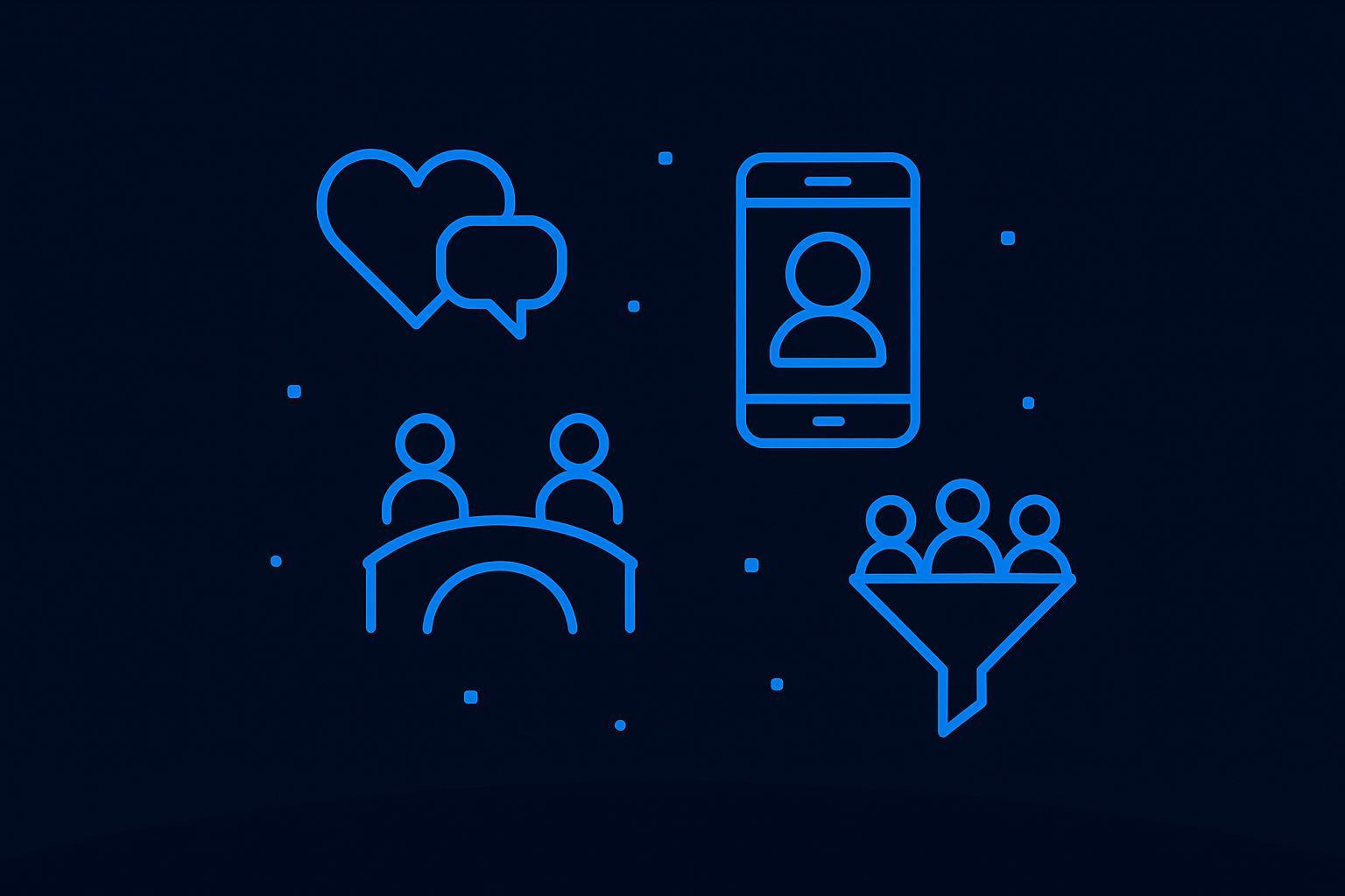
Designing a Dating Website: 2026 Founder's Guide
Most advice on designing a dating website is too shallow. It treats the product like a stack of screens: signup, profiles, swipes, chat, premium. That approach is why so many dating startups ship something that looks complete but fails where it matters. Users don't stay, matches don't turn into conversations, and trust breaks the first time abuse shows up.
A dating site is closer to a system than a brochure. You're not designing pages. You're designing incentives, ranking logic, moderation workflows, and a business model that has to work without poisoning the user experience. The hard part isn't adding features. The hard part is choosing what to optimize, what friction to keep, and what friction to remove.
That has been true since the beginning of the category. Long before mobile apps, dating products were already built on structured data and matching logic. In 1959, two Stanford students created an early matchmaking questionnaire, and in 1965 Harvard students used a questionnaire plus an IBM 1401 computer for “Operation Match,” which cost about $3 per person. Modern systems still reflect that same core idea, and eHarmony later pushed it further with a questionnaire of over 450 questions, as summarized in this history of online dating. The interface changes. The core product remains data collection, ranking, and trust.
Table of Contents
- Defining Your Niche and Business Model
- Mapping the Core User Journey
- Designing for Trust and User Safety
- Choosing the Right Technology Stack
- Launching and Scaling Your Platform
Defining Your Niche and Business Model
The dating market isn't a blank canvas. It's crowded, habit-driven, and hard to break into. The global dating-app market reached $6.18 billion in revenue in 2024, with over 350 million users worldwide and about 25 million paying for premium features, which means roughly 7% of users generate the revenue according to Business of Apps dating market data.
That one number should force discipline. If you're designing a dating website for "everyone," you'll inherit the hardest possible version of the freemium problem. You need a huge free audience, but only a small slice pays. If your niche is weak, your acquisition is expensive, your match quality is generic, and your premium plan feels like a tax on frustration.

Start with a market you can actually win
Most founders define the niche too loosely. "Professionals," "serious relationships," and "modern dating" are not niches. They're slogans. A real niche has a clear identity boundary and a clear reason users expect better outcomes there than on a broad marketplace.
A useful filter is this:
| Question | Weak answer | Strong answer |
|---|---|---|
| Who is it for? | Adults looking for relationships | A clearly identifiable community with shared context |
| Why will they switch? | Better UI | Better relevance, norms, and trust |
| What makes matching better? | More profiles | Better constraints and cleaner intent |
| Why will they pay? | To unlock basic utility | To improve outcomes or reduce friction |
If you can't answer those four points crisply, you're still designing a generic website with a dating skin.
Practical rule: Your niche should improve match quality before your algorithm does. If the room is better curated, the ranking has an easier job.
Your revenue model shapes the product
Founders like to postpone monetization decisions. That's a mistake. Revenue mechanics change product behavior from day one. If you rely on subscriptions, you need a reason to return. If you rely on premium boosts or visibility tools, you risk creating a marketplace that feels rigged. If you add ads too early, you inject distraction into a product that depends on emotional focus.
For most MVPs, keep monetization narrow. Pick one premium reason to pay. Common examples are stronger filters, better visibility controls, or tools that reduce low-intent interactions. What doesn't work well early is stacking multiple paywalls on top of a weak matching experience. Users read that as desperation.
If you're planning subscriptions and AI-assisted features in the same product, it's worth reviewing patterns from SaaS billing and feature gating before you build. This guide on AI features and subscription billing in SaaS is useful because it frames monetization as product architecture, not a Stripe checkbox.
Pick a niche that creates better behavior
This is the part many founders miss. A good niche is not only about acquisition. It changes user behavior in ways that reduce moderation burden and improve conversations.
Some examples of what to look for:
- Shared context: People understand why they're there and what "fit" means.
- Clear norms: Users know how direct, serious, or playful the interaction should be.
- Cleaner profiles: Members can fill out relevant details without feeling random or invasive.
- Higher signal messaging: Openers have more substance because there's more common ground.
A bad niche does the opposite. It narrows your audience without improving intent, trust, or retention.
When you're designing a dating website, your niche and business model are the first product decisions. Everything after that is implementation.
Mapping the Core User Journey
A good MVP doesn't begin with a feature map. It begins with one measurable path. The best build guidance for dating products recommends a single onboarding-to-first-message funnel built around registration, profile editing, photo upload, matching or feed, filters, chat, moderation, and responsive mobile UX, as outlined in this dating website MVP guide.
That advice is more important than it sounds. Early-stage dating products die from sideways complexity. Founders add events, icebreakers, stories, compatibility quizzes, video intros, gifts, boosts, badges, and AI wingman features before the core loop works. Then they can't tell which part is broken.

Design one funnel, not twenty features
The core funnel is simple on paper:
Landing and value recognition
The visitor should understand the niche immediately. If the homepage needs too much explaining, your positioning is weak.Registration
Ask only for what you need to create an account and continue. Anything beyond that belongs later in progressive onboarding.Profile completion Quality starts with this step. Photos, identity fields, preferences, and a short bio matter because ranking quality depends on usable inputs.
Discovery and match delivery
Users need to see relevant people quickly. Not all at once. Quickly.First message
This is the moment that validates the entire system. Until a user sends or receives a meaningful first message, your product hasn't delivered.Return visit
Retention begins here, not at signup.
The job of the MVP is to get a user from curiosity to first contact with as little wasted motion as possible.
Where founders usually add the wrong complexity
The biggest onboarding mistake is front-loading too much profile work before the user sees any value. Long forms feel rational to a founder because better data should improve matching. But long forms before relevance create abandonment.
A better pattern is staged commitment:
- Step one: Basic account creation
- Step two: Minimal profile needed to enter discovery
- Step three: Prompts that enable more visibility or better recommendations
- Step four: Contextual nudges to complete missing fields after intent is proven
The second mistake is pretending mobile can be handled later. It can't. Dating behavior is, in practice, mobile-first, and even if you start with a website, the product has to feel fast, thumb-friendly, and narrow-screen aware from day one.
Notification design also belongs in the core journey, not as an afterthought. If your message alerts are noisy, delayed, or unclear, you create chat fatigue fast. This breakdown of notification system design patterns is a useful reference for deciding what should trigger an alert, what should stay in-app, and what should never interrupt the user.
Treat matching like ranked delivery
A lot of founders still think discovery is mostly a searchable directory with filters. That's too primitive. Match delivery needs to feel curated even before you have deep behavioral data.
That means making deliberate decisions about:
- Eligibility rules: Who can appear to whom.
- Profile quality thresholds: Incomplete or low-signal profiles shouldn't flood the feed.
- Freshness: Active users should usually surface differently than stale accounts.
- Intent alignment: Casual, serious, local, long-distance, and niche-specific preferences should affect ranking.
You don't need a fancy AI stack to do this at MVP stage. You need clean constraints and a ranking model you can inspect. Founders often chase sophistication too early when they need better input quality and simpler scoring.
A practical funnel review asks questions like these:
| Funnel step | What works | What fails |
|---|---|---|
| Signup | Fast, clear, low-friction entry | Asking for everything upfront |
| Profile | Focused prompts and useful defaults | Blank bios and optional photos everywhere |
| Discovery | Small set of relevant profiles | Endless low-quality browsing |
| Messaging | Easy first contact, clear status | Confusing inboxes and dead-end chats |
| Return | Useful reminders and fresh relevance | Spammy notifications or silence |
When you're designing a dating website, every screen should justify itself by helping users move through that funnel. If it doesn't help, cut it.
Designing for Trust and User Safety
Most founders say trust matters. Then they build it like a footer page. That's backwards. Trust is the product layer that determines whether matching, messaging, and monetization can work at all.

Independent build guides often mention moderation and verification as requirements, but the main challenge is the tradeoff between identity verification, reporting UX, location privacy, and anti-scam safeguards. That tradeoff, and the need to turn those pieces into a coherent system, is captured well in this dating website trust and safety guide.
Trust signals need to change behavior
A verification badge means nothing if users don't understand what was verified. Photo verified is different from identity verified. Email confirmed is different from phone confirmed. You need plain-language trust signals that map to actual user decisions.
Good trust design answers practical questions fast:
- Who am I talking to?
- How certain is the platform about that identity?
- Can I limit what this person sees about me?
- What happens if something goes wrong?
Safety tools that users don't trust become decorative. Decorative safety tools are worse than no tools because they create false confidence.
Authentication choices matter here too. Session handling, account recovery, bot resistance, and provider setup all affect abuse prevention long before a moderator reviews anything. If you're comparing implementation paths, this review of modern auth stacks for web apps is useful for understanding tradeoffs between hosted auth services and database-centered setups.
Reporting has to feel responsive, not decorative
The worst report flow is a tiny icon that disappears into a generic form. Users need to know three things immediately: they were heard, the report has context, and they still control the interaction.
A solid reporting flow usually includes:
- Context-aware entry points: Report a profile, a message, an image, or an off-platform request separately.
- Action choices: Block, mute, hide, unmatch, and report shouldn't be mashed into one vague button.
- Expectation setting: Tell users what happens next in plain language.
- Moderator context: Preserve relevant logs so reviewers don't reconstruct events from scratch.
Later in the journey, some users want extra diligence before meeting offline. A practical resource to share in support content is this online dating background check guide, which explains common checks people consider and where caution still matters.
Here is a useful walkthrough on the broader topic of dating app safety and user protection:
Privacy controls matter as much as moderation
Founders often focus on catching bad actors and underinvest in user-controlled privacy. That's a mistake because many users decide whether to engage based on control, not just enforcement.
Privacy design should cover issues like:
- Location exposure: Approximate versus precise presence
- Profile visibility: Searchable, limited, invite-only, or hidden modes
- Image sharing rules: What can be saved, shared, or blurred
- Contact boundaries: How users manage escalation from on-platform chat to off-platform contact
The strongest dating products don't treat safety as a single feature set. They combine identity confidence, moderation, privacy controls, and response workflows into one operating system.
Choosing the Right Technology Stack
The stack decision isn't philosophical. It's operational. You're choosing how quickly you can ship, how much control you need, and how much complexity your team can realistically handle.
For dating products, the architecture has to treat matching as a constrained ranking problem, not a simple search, and the backend needs secure authentication, real-time messaging, moderation logging, and admin controls from day one, as explained in this dating app MVP architecture guide.

Custom code versus low-code versus AI builders
Custom code gives you maximum flexibility. It also gives you the longest path to validation and the most room to overengineer. If you already have a strong engineering team and a differentiated trust or ranking model, custom can make sense. If you're still searching for product-market fit, custom often becomes a way to delay contact with reality.
Low-code sits in the middle. You move faster on CRUD flows, dashboards, and integrations, but real-time messaging, nuanced permissions, and custom moderation flows can get awkward depending on the platform.
AI-powered builders have become a serious option for MVPs because they compress setup work that used to consume weeks. Tools in this category can generate pages, wire up databases, connect auth, and support iterative changes through natural-language prompts. One example is Webtwizz, which is positioned for building full-stack web apps with integrations like payments, auth, AI services, analytics, and email.
What your backend must support on day one
A dating product can fake a lot in the UI. It can't fake backend readiness when users begin reporting abuse, editing profiles, and expecting messages to arrive instantly.
Your first version needs support for at least these system concerns:
| Capability | Why it matters |
|---|---|
| Secure auth | Prevents account abuse and supports trust signals |
| Real-time chat | Messaging delay breaks the core loop |
| Admin tooling | Moderators need visibility and action controls |
| Logging | Review and appeal workflows need evidence |
| Ranking inputs | Matching quality depends on structured data |
| Responsive delivery | The website must behave well on mobile browsers |
The wrong way to build is screen-first. You end up with a polished interface sitting on brittle logic. The right way is capability-first. Then the interface can stay thin and honest.
Pick the stack that gets your first trustworthy version live, not the stack that flatters your technical ambition.
How to choose without fooling yourself
Three questions usually expose the right answer:
How many product assumptions are still unproven?
If the answer is "a lot," bias toward speed.How unusual is your matching or trust model?
If it's mostly standard with a niche twist, you probably don't need full custom yet.Who will maintain the system after launch?
A solo founder should optimize for clarity and iteration speed, not maximum theoretical control.
When you're designing a dating website, stack choice isn't about trendiness. It's about whether you can launch, learn, and revise before your runway disappears.
Launching and Scaling Your Platform
Launch day doesn't validate the product. It only starts the feedback loop. The teams that do well after launch are the ones that treat operations, user learning, and retention as one continuous system.
A 2024 benchmark of seven major dating services found that platforms are often optimized for activity rather than post-match resolution, which points to a common design gap: making matches is not the same as helping users progress toward real interaction, according to this online dating benchmark study.
Launch readiness is mostly operational
Before launch, check boring things first. Those are the things that hurt you fastest.
Use a pre-launch pass like this:
- Moderation workflow: Make sure reports route somewhere real, with clear ownership.
- Profile quality rules: Decide what incomplete, suspicious, or duplicate profiles trigger.
- Messaging edge cases: Test blocks, unmatched states, deleted accounts, and failed deliveries.
- Privacy defaults: Review every user-visible setting as if a cautious user were reading it.
- Support language: Write responses for the most likely trust and billing issues before they happen.
A dating platform with weak operations feels broken even when the interface looks polished.
Measure progress after the match
A lot of founders obsess over signups because signups are easy to count. That leads them straight into vanity metrics. The better questions are behavioral.
Track things like:
- Profile completion quality: Are people giving the system enough to work with?
- First-message rate: Are matches turning into action?
- Conversation continuation: Are chats dying immediately or developing?
- Return behavior: Do users come back after first contact?
- Upgrade timing: Does payment happen after value is proven, or only after frustration builds?
Those signals tell you whether the product loop is healthy. They also tell you whether premium is supporting the experience or distorting it.
Growth gets easier when the product resolves intent
Product and acquisition finally meet. If users feel like your platform helps them move from match to conversation to real-world progress, word of mouth becomes easier. If your product traps them in endless activity, growth gets expensive and brittle.
Content and search can help if your niche is sharp enough. Founders working on organic acquisition should study approaches like these advanced SEO strategies for dating sites, especially when they need landing pages for niche intent, safety content, and long-tail discovery terms.
The product roadmap after launch should favor improvements that reduce friction in the dating journey. Better first-message prompts. Smarter reminders. Cleaner inbox states. Stronger trust controls. Better handoff from match to actual conversation. That work isn't flashy, but it's where retention usually lives.
If you're building a dating MVP and want a faster path to a working product, Webtwizz is worth considering for the first version. It lets founders ship a full-stack web app with visual editing, auth, database integrations, payments, AI features, analytics, and email wiring without starting from a blank codebase, which is useful when the primary job is validating trust, matching, and retention before investing in a heavier build.
Last updated: June 7, 2026
Start building
Your idea, live in minutes.
Describe what you want. WebTwizz builds the real thing, then you click to change anything. No code needed.
Get started for free, no credit card needed.